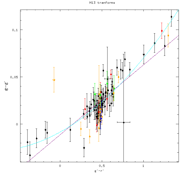
The following image has several things going on with it at once. It is a plot of g'-r' Vs. g-g' of the combined Clem and Jen data
for the fifth frame of Jen. Before the plot was made points with errors greater than .1 or sep values lower than 6 were cut, so they do not appear on the graph. The points in black are points in the middle of the frame, that is inside 100 pixels from an edge. Points
in red are within the first 100 pixels on the x axis. Blue points are in the last 100 pixels on the x axis. Points within the first 100
pixels on the y axis are in green. Orange points are in the last 100 y axis pixels (note: points that were within 100 pixels of an edge
in both x and y were discarded to eliminate confusion over which color they should be). Next, least-squares fits were done on the middle
points (the black ones). The linear fit is shown in purple, and it is a line of the form y = .07406*x - .01119. The cyan line is the
quadratic fit, of the form y = -.00836 + .04893*x + .0298*x^2.